
CSS Float
float property
-
요소를 떠 있게(요소가 기본 레이아웃 흐름에서 벗어나 요소의 모서리가 페이지의 왼쪽이나 오른쪽에 이동하는 것) 한다.
- 사용 시, 요소의 위치를 고정시키는 position: absolute를 사용하면 안됨
- 다양한 오류 케이스가 나타날 수 있지만 공식적인 해결방안은 없음(비공식적인 방안만 많음)
- 수평 정렬을 위해 사용가능하지만 차라리 flexbox를 사용하자.
| Value | 설명 |
|---|---|
none |
요소를 떠 있지 않게 함 (default) |
right |
요소를 오른쪽으로 이동 |
left |
요소를 왼쪽으로 이동 |
clear property
- float를 해제하는 property
| Value | 설명 |
|---|---|
none |
양쪽 float를 사용 가능 (default) |
right |
우측 float를 사용 해제 |
left |
좌측 float를 사용 해제 |
both |
양쪽 float를 사용 해제 |
<body>
  <img src="hos.gif" style="float: right; width: 100px; height: 50px" />
  <div>Vue는 input form의 value 설정시 v-bind를 사용한다</div>
  <div style="clear: right">람다식을 자유롭게 쓰는 그날까지 브론즈 문제는 람다로.. print((lambda x, y: x * y // 2)(*map(int, input().split())))</div>
</body>

정렬(float)
-
수평 정렬할 요소들을 float: left로 설정 시 좌측 정렬, right로 설정 시 우측 정렬(수평 중앙 정렬은 margin property를 사용해야 함)
-
우측 정렬 시 먼저 설정한 요소부터 우측 끝에 출력됨
<style>
div {
color: white;
font-weight: bold;
font-size: 50px;
border-radius: 5px;
width: 100px;
height: 100px;
}
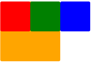
.box1 {
background: red;
float: left;
}
.box2 {
background: green;
float: left;
}
.box3 {
background: blue;
float: right;
}
.box4 {
background: orange;
float: right;
}
</style>
</head>
<body>
<div class="box1">1</div>
<div class="box2">2</div>
<div class="box3">3</div>
<div class="box4">4</div>
</body>

기본적인 문제점
  <style>
    .box {
      width: 100px;
      height: 100px;
      border-radius: 5px;
    }
    .box1 {
      background: red;
      float: left;
    }
    .box2 {
      background: green;
      float: left;
    }
    .box3 {
      background: blue;
      float: left;
    }
    .box4 {
      background: orange;
      width: 200px;
      height: 200px;
    }
  </style>
</head>
<body>
  <div class="box box1"></div>
  <div class="box box2"></div>
  <div class="box box3"></div>
  <div class="box box4"></div>
</body>
- box4는 block 속성이지만 box1, 2, 3이 부유 특성을 가지고 있기 때문에 겹쳐서 표현이 됨
💨 이를 해결하기 위해 다음과 같이 사용한다.
  <style>
    .box {
      width: 100px;
      height: 100px;
      border-radius: 5px;
    }
    .box1 {
      background: red;
      float: left;
    }
    .box2 {
      background: green;
      float: left;
    }
    .box3 {
      background: blue;
      float: left;
    }
    .box4 {
      background: orange;
      width: 200px;
      height: 200px;
    }
    /* 아래와 같이 clearfix의 속성을 정의해준다 */
    .clearfix::after {
      content: '';
      clear: both;
      display: block;
    }
  </style>
</head>
<body>
  <div class="clearfix">
    <div class="box box1"></div>
    <div class="box box2"></div>
    <div class="box box3"></div>
  </div>
  <div class="box box4"></div>
</body>

특성
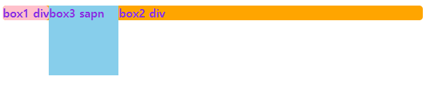
  <style>
    div {
      margin: 0 auto;
      border-radius: 5px;
    }
    .box1 {
      background: pink;
      color: blueviolet;
      font-weight: bold;
      float: left;
    }
    .box2 {
      background: orange;
      color: blueviolet;
      font-weight: bold;
    }
    .box3 {
      background: skyblue;
      color: blueviolet;
      font-weight: bold;
      float: left;
      width: 100px;
      height: 100px;
    }
  </style>
</head>
<body>
  <div class="box1">box1 div</div>
  <span class="box3">box3 sapn</span>
  <div class="box2">box2 div</div>
</body>
- float property를 설정한 요소는 display 특성을 block 특성으로 변경함
- box3은 span이라 원래 inline 특성을 가지지만 block으로 변경되어 width와 height 설정이 가능해짐
- block 특성을 가진 요소는 width를 미설정 시 자동으로 100%가 되지만 float property를 설정한 요소는 요소의 크기만큼 width가 설정되어 inline-block으로 설정해준 것과 동일하게 동작함
- float property가 설정된 요소에 content가 있을 경우 해당 content의 너비와 높이는 다음 요소의 content에 영향을 줌(position: absolute처럼 완벽한 부유 특성과 다른 부유 특성을 가짐)

댓글남기기