
CSS Transition
Transition
CSS property 값 변경 시, 값 변화가 일정 시간에 걸쳐에 걸쳐 일어나도록 하는 것.
- ie의 호환성을 확인해야 함(10.0+)
- transition은 자동으로 발동되지 않는다. :hover와 같은 가상 클래스 선택자(Pseudo-Classes) or JavaScript의 부수적인 액션에 의해 발동함.
- 자동 발동을 위해선 Animation을 사용해야 함
transition의 주요 property
| property | 설명 | 기본값 |
|---|---|---|
transition-property |
트랜지션의 대상이 되는 CSS property를 지정(여러개 지정 시, 쉼표(,)로 구분 ) | all |
transition-duration |
트랜지션이 일어나는 지속시간을 초 단위(s) 또는 밀리 초 단위(ms)로 지정 | 0s |
transition-timing-function |
시간별 트랜지션 속도를 설정하는 함수를 지정 | ease |
transition-delay |
트랜지션을 언제 시작할지를 초 단위(s) 또는 밀리 초 단위(ms)로 지정 | 0s |
transition |
단축 property |
transition-property와 transition-duration
-
transition-property에서 지정된 프로퍼티 별로 transition-duration 값을 설정할 수 있음
-
모든 CSS property가 트랜지션의 대상이 될 수 없음
- 대상이 될 수 있는 properties
/* Box model */ width height max-width max-height min-width min-height padding margin border-color border-width border-spacing /* Background */ background-color background-position /* 좌표 */ top left right bottom /* 텍스트 */ color font-size font-weight letter-spacing line-height text-indent text-shadow vertical-align word-spacing /* 기타 */ opacity outline-color outline-offset outline-width visibility z-index -
layout에 영향을 주는 트랜지션 효과는 브라우저에게 스트레스를 주어 성능 저하의 요인이 되므로 되도록 회피해야 함
- layout에 영향을 주는 properties
width height padding margin border
display position float overflow
top left right bottom
font-size font-family font-weight
text-align vertical-align line-height
clear white-space
@예시 코드
아래 두 코드는 같다

div {
  transition-property: width, height, opacity, background-color;
  transition-duration: 2s, 1s;
}
/* 단축 property*/
div {
  transition: width 2s, height 1s, opacity 2s, background-color 1s;
}
transition-timing-function
- 트랜지션 효과의 변화 흐름, 시간에 따른 변화 속도와 같은 일종의 변화의 리듬을 지정
- 기본적으로 cubic-bezier 함수를 따름
| Value | 효과 |
|---|---|
ease |
느리게 시작하여 점점 빨라졌다가 다시 느려지면서 종료 (default) |
linear |
시작부터 종료까지 등속 |
ease-in |
느리게 시작한 후 일정한 속도에 다다르면 그 상태로 등속 |
ease-out |
일정한 속도로 시작해서 점점 느려지면서 종료 |
ease-in-out |
ease와 거의 비슷하지만 속도가 빨라지는 시간이 ease보다 김 |
step-start |
시작하자마자 바로 종료 |
step-end |
일정 시간 후 바로 종료 |
steps(n, start or end) |
n단계로 나누어서 변화시킴 |
cubic-bezier(n, n, n, n) |
베지어 곡선을 따름 n은 0~1의 값을 가짐 |
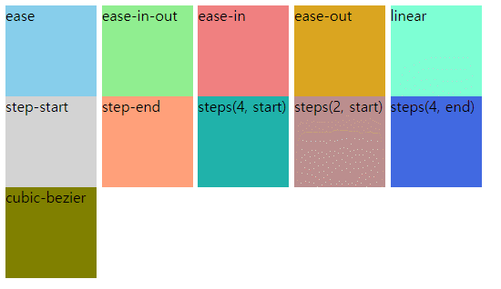
  <style>
    span {
      display: inline-block;
      width: 100px;
      height: 100px;
      transition-property: border-radius;
      transition-duration: 1s;
    }
    .box1 {
      background: skyblue;
      transition-timing-function: ease;
    }
    .box2 {
      background: lightgreen;
      transition-timing-function: ease-in-out;
    }
    .box3 {
      background: lightcoral;
      transition-timing-function: ease-in;
    }
    .box4 {
      background: lightcyan;
      transition-timing-function: ease-out;
    }
    .box5 {
      background: lightgoldenrodyellow;
      transition-timing-function: linear;
    }
    .box6 {
      background: lightgray;
      transition-timing-function: step-start;
    }
    .box7 {
      background: lightsalmon;
      transition-timing-function: step-end;
    }
    .box8 {
      background: lightseagreen;
      transition-timing-function: steps(4, start);
    }
    .box9 {
      background: rosybrown;
      transition-timing-function: steps(2, start);
    }
    .box10 {
      background: royalblue;
      transition-timing-function: steps(4, end);
    }
    .box11 {
      background: olive;
      transition-timing-function: cubic-bezier(0.23, 1, 0.32, 1);
    }
    span:hover {
      border-radius: 50px;
    }
  </style>
</head>
<body>
  <span class="box1">ease</span>
  <span class="box2">ease-in-out</span>
  <span class="box3">ease-in</span>
  <span class="box4">ease-out</span>
  <span class="box5">linear</span>
  <span class="box6">step-start</span>
  <span class="box7">step-end</span>
  <span class="box8">steps(4, start)</span>
  <span class="box9">steps(2, start)</span>
  <span class="box10">steps(4, end)</span>
  <span class="box11">cubic-bezier</span>
</body>
box1 ~ box5까지
box6 ~ box11까지

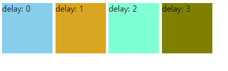
transition-delay
  <style>
    span {
      display: inline-block;
      width: 100px;
      height: 100px;
      transition-property: border-radius;
      transition-duration: 1s;
    }
    .box1 {
      background: skyblue;
      transition-timing-function: ease;
      transition-delay: 0s;
    }
    .box2 {
      background: goldenrod;
      transition-timing-function: ease-out;
      transition-delay: 1s;
    }
    .box3 {
      background: aquamarine;
      transition-timing-function: linear;
      transition-delay: 2s;
    }
    .box4 {
      background: olive;
      transition-timing-function: cubic-bezier(0.23, 1, 0.32, 1);
      transition-delay: 3s;
    }
    span:hover {
      border-radius: 50px;
    }
  </style>
</head>
<body>
  <span class="box1">delay: 0</span>
  <span class="box2">delay: 1</span>
  <span class="box3">delay: 2</span>
  <span class="box4">delay: 3</span>
</body>
transition 단축 property
/* property, duration */
transtion: width 1s;

/* property, duration, delay */
transtion: width 1s 2s;

/* property, duration, timing function, delay */
transtion: width 1s linear 2s;

댓글남기기